

The Champions League season is wrapping up with the final match scheduled for May 30 at the Puskas Arena in Budapest, Hungary. The competition brings together the best teams from around Europe which includes some of the biggest names in the sport. With success and European pedigree often comes brand recognition; every fan recognises the black and red of Milan, they recognise the sheet white of Madrid. With that in mind, we will be taking a look at some of the best and worst kits on display in this year’s tournament.
Best Champions Kits of 2026
Chelsea
Chelsea cruised through the Group Stage of the Champions League with 16 of a possible 24 points. While they were bounced rather easily by PSG, they at least looked good. The Blues have been able to make a solid blue jersey into a strong fashion statement this season. The white collar blends perfectly into the dark blue of the jersey but what really makes this is the collection of logos across the chest. The combo of the Nike swoosh, club badge, and the Club World Cup winners patch makes for a great look as the gold of the tournament patch combines with the whites of the other two logos. Whether a new Chelsea manager will take the team further next season remains to be seen, but at least the club did something very well indeed.
You can replicate such a combination of your own with custom patches available to order for your own kit orders. These can mix together sports or add a distinct vibe to the jersey that nobody else can have.
Borussia Dortmund
After a disappointing result in the Champions League Playoff tie with Atalanata, which surprised many using online betting sites, the German side have bounced back nicely in the Bundesliga. Though the title is already won by Bayern Munich, the club have received much attention for its stellar marketing. Their base colour is a very nice shade of yellow and they tend to incorporate this quite well. This year’s jersey has a nice black trim at the collar and underarms, the black Vodafone logo, black Puma logo, and club badge all pop against the golden yellow base. It is a slick design that is one of the best of the tournament this season.
Inter
While the black and red of AC Milan is one iconic look, their rivals and neighbours Inter have their own legendary Blue and Black kit that is one of the nicest in the tournament. The striped look has the blue lines looking almost like light refractions against the black base for a very sleek and modern design that will catch the eye of viewers. The Inter logo is one of the nicest in football with the two stars over it standing out well on this design.
Worst Champions League Kits of 2026
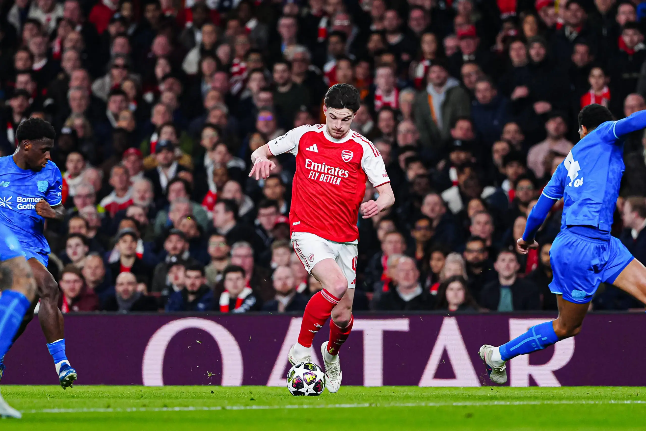
Arsenal
Despite a successful Champions League season, we can’t say the Gunners are doing it all in style. With mostly smooth, flowing football that pundits and bettors at Melbet have enjoyed watching on the pitch, the club’s massive international fan base has mixed feelings surrounding the kit. Some teams are able to use their base colour in interesting and unique ways to look good but the Gunners have absolutely thrown in the towel with their home kit for the 2026 campaign. The very bland red into white combination is fine but it doesn’t work nearly as well as some other teams who have managed to use colours in more interesting ways.
Club Brugge
Inter made blue and black a slick and standout design, Club Brugge on the other hand have an AI-looking jersey with bland stripes going down a bland base. It’s not necessarily a bad jersey but it is far more basic and cheap looking than a lot of their competitors with nothing interesting being done with the colour combination
Kairat Almaty
On the field, Kairat Almaty were a fairytale story of Kazakhstan’s top team getting to the league phase for the first time ever, they captured the attention of fans globally with some of their young stars announcing themselves on such a big stage. Unfortunately, their home kit was one of the worst in the tournament. The yellow and black stripes are not done well and look very cheap with the big window at the back for the number and name being absolutely gaudy.
Union SG
Back to Belgium for another disappointing kit and once again we have a Yellow and Black combination. The navy shoulders are cut off completely from a block of yellow that looks like it was lazily thrown together. This combination of colours has a lot of potential but Union SG didn’t use it to the fullest.
Bodo/Glimt
Bodo/Glimt play excellent football, but their home kit is a solid block of yellow that just doesn’t look good. It isn’t even a royal shade of yellow, it is just basic and bland and one of the cheaper designs used in the Champions League this year.


Leave a Reply